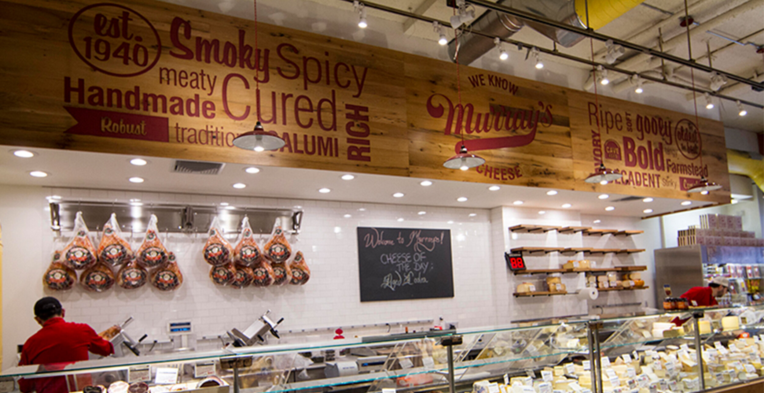
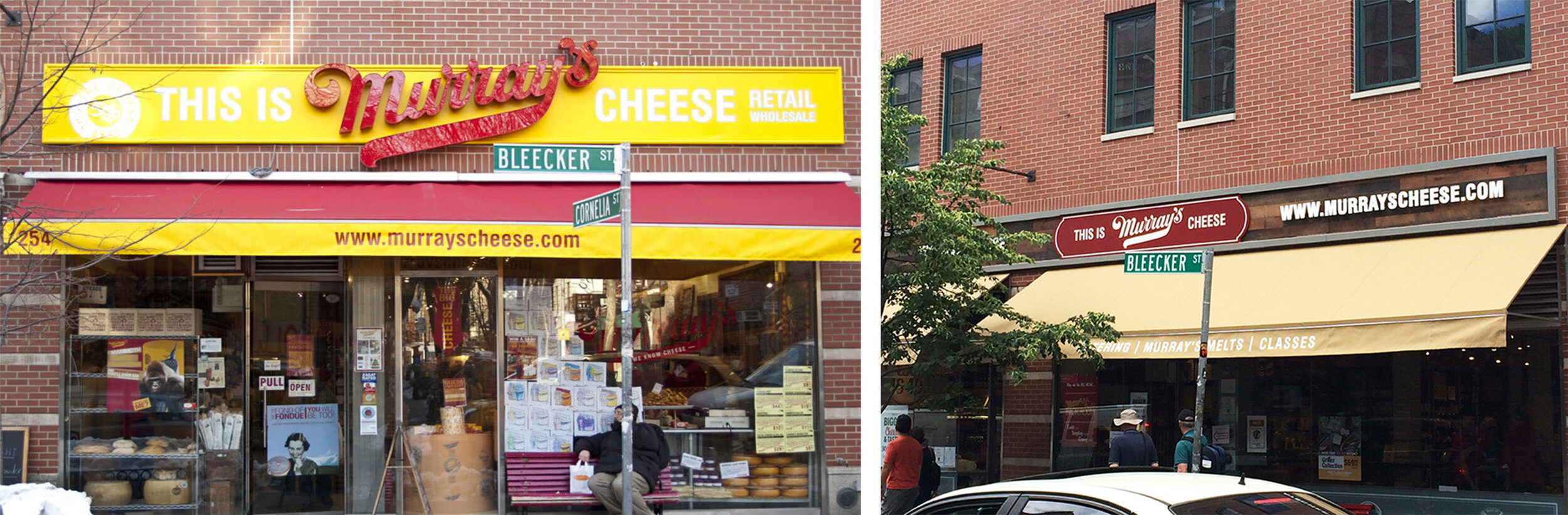


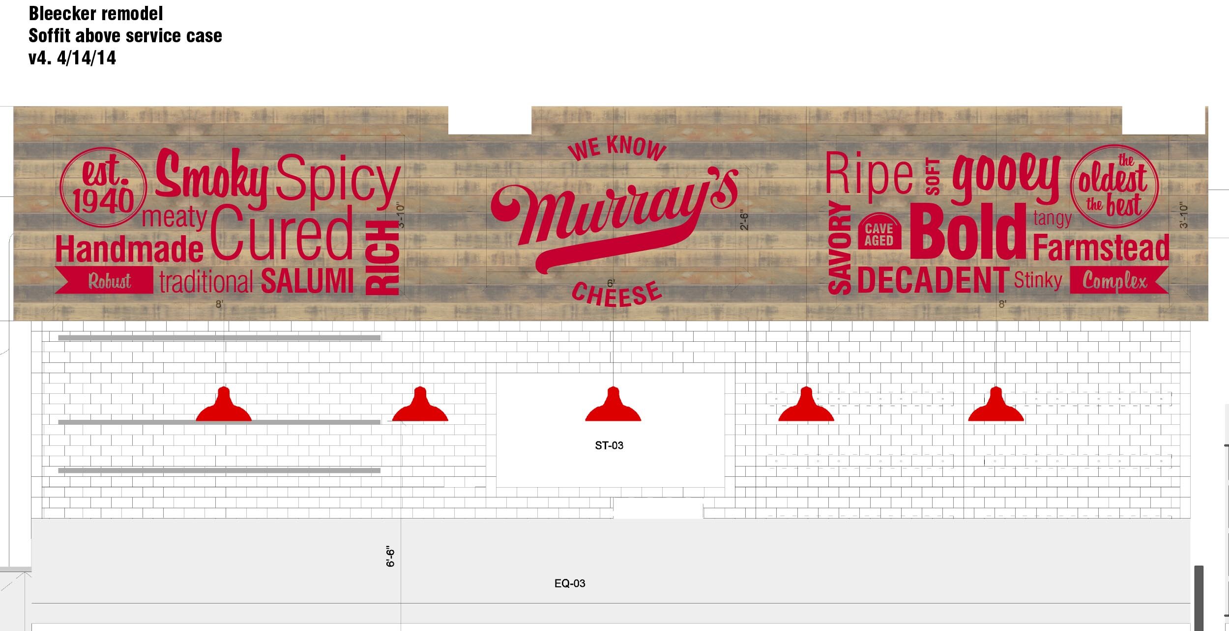
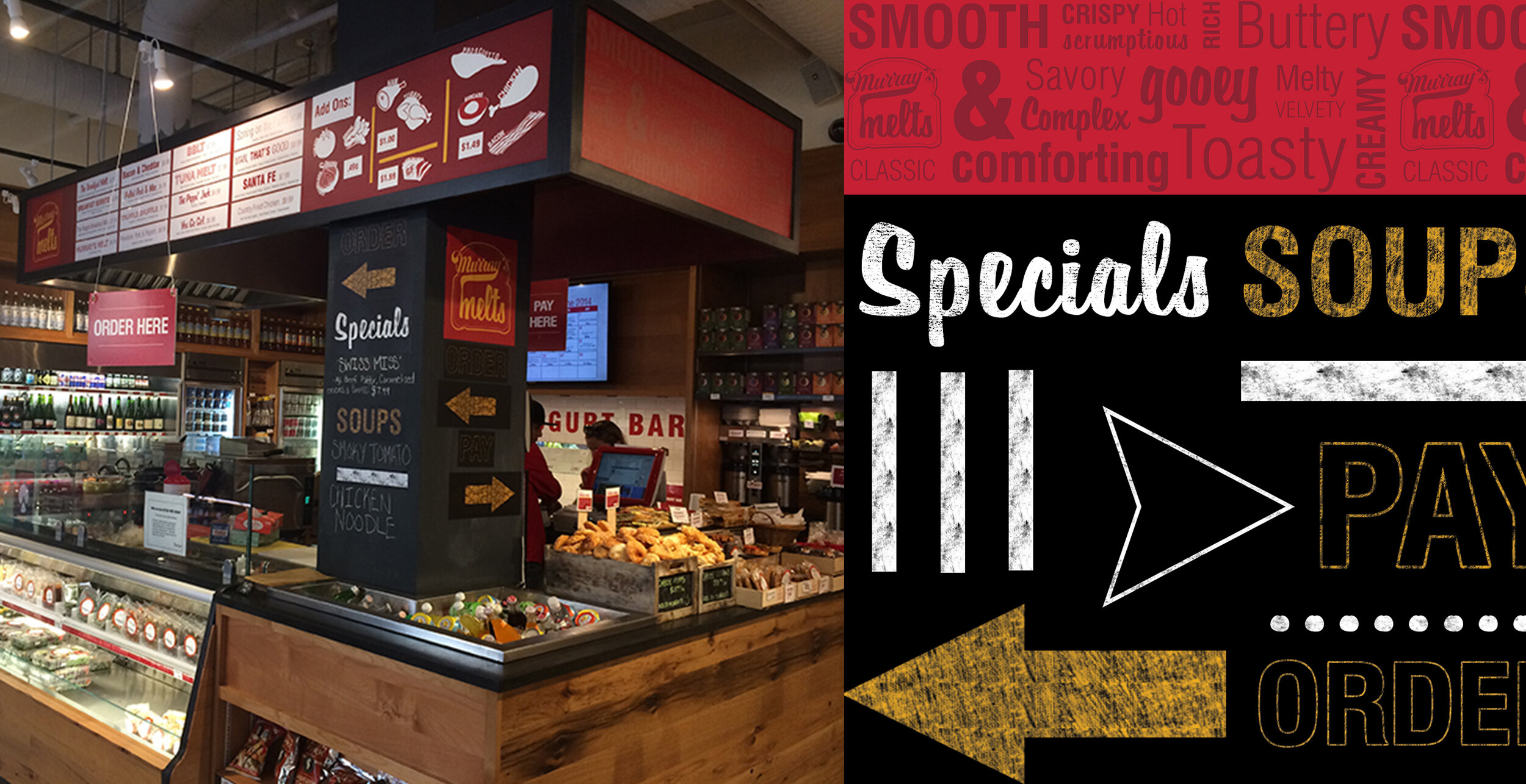


I had the absolute honor playing a major role in the Murray’s cheese remodel including all permanent graphics, blade signs, and decor while I was Sr. Designer.
The goal was to keep Murray’s fun and approachable while elevating the brand. This was achieved by cleaning up the space, toning down the yellow, introducing new vintage fonts, playing homage to the neighborhood and introducing new, fun, playful icons.
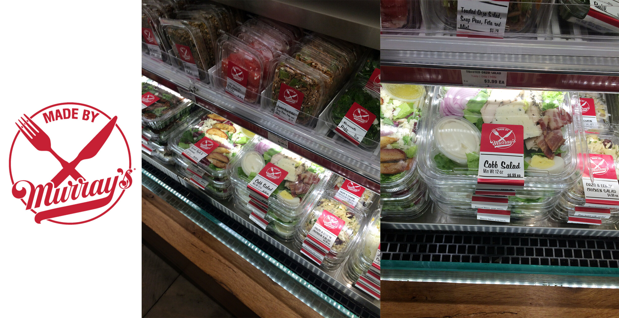
The Made by Murray’s Logo + Labels was more of a function over form project. These were printed in house on a datamax machine so the design had to be extremely limited. The goal was really to think about the shapes of labels and how the product was being merchandised. For example using a half moon on the dips so you wouldnt see the the product falling while being displayed upright.